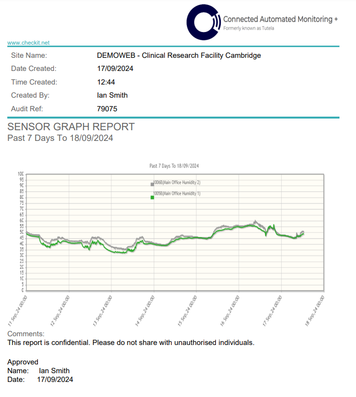
A Compare Graphs Report is a record of multiple sensors' readings in graphical form.
You can compare the readings of up to 8 sensors.
You can save a copy of the report to: the documents library, your device, or both.
You cannot export data from a Compare Graphs Report to Excel.
View a Compare Graphs Report
-
Log in to the CAM+ Website.
-
Click the sensor icon on the relevant department.
-
Click Compare Graphs.
-
Check the boxes on the sensors you want to compare (up to 8).
-
Click the view comparison icon. You will see the sensors' readings plotted on the graph in various colours and a legend explaining which sensor each colour represents.
Compare Graphs Reports do not display high and low alarm and alert thresholds.
Click on a sensor in the legend to remove it from the graph. Click again to re-add the sensor.
-
Use the following fields on the left to filter data:
-
Calendar -to view readings from a specific date range & time
-
24 hours - to view readings from the last 24 hours
-
7 days - to view readings from the last 7 days
-
30 days - to view readings from the last 30 days
-
Use the left and right arrows to view readings from the previous/next day.
Turn on the Auto-Scale toggle above the top right of the graph to automatically adjust the axis limits, ensuring all your data fits perfectly within the view.
Save a Copy of a Compare Graphs Report
You must have the Manage Library permission enabled to save a file to the Documents Library. See View/Edit Your User Profile to check which permissions you have enabled.
-
Click Report.
-
(Optional) Add some comments to the report.
-
Click Confirm.
-
Select where you want to save the report:
-
To electronic library (to the documents library)
-
To printer (to your device)
-
To printer & electronic library (to both)
-
-
Click Confirm.
If you save a Compare Graphs Report to the documents library, it will be filed under Documents Library> System Users>Reports Pending Secondary Sign Off