Asset Health & Availability measures the performance of your fridges and freezers, highlighting equipment in poor health. This enables you to take preventative action to avoid interruption in your operations and loss of revenue.
This is an optional feature for customers who use Checkit sensors. Please contact us if you would like to enable it.
How to Access Asset Health & Availability
You must be an Administrator or Safety Manager to view Asset Health & Availability. See User Roles for more details.
-
Go to the Control Centre.
-
Go to Reports> Asset Intelligence.
-
Select Asset Intelligence for asset health and availability
-
Select the location you want to view from the options on the left.
-
Use the tabs at the bottom of the page to navigate between:
-
Asset Health
-
Availability
-
Asset Health Tab
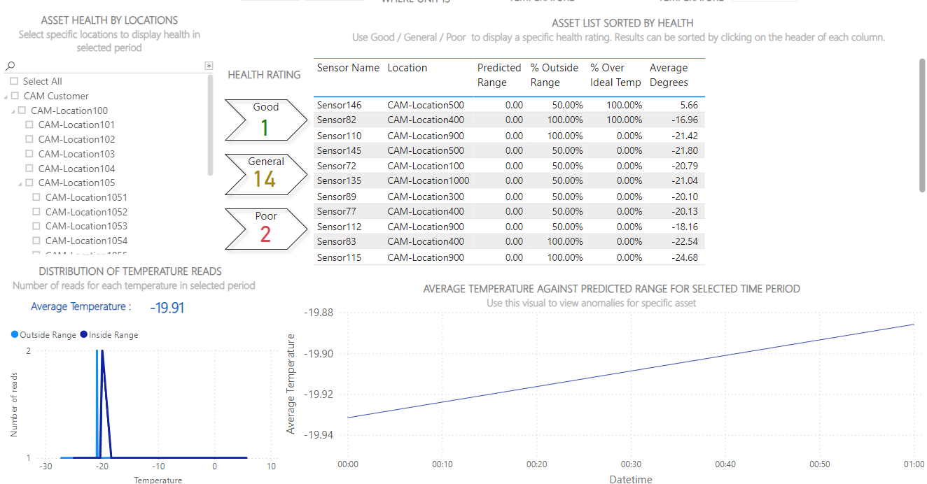
The Asset Health tab rates fridges and freezers and highlights units which show poor, general, and good performance based on anomalous refrigeration behaviour (see image 2).
To analyse your data:
-
Select the date range you want to view.
You can show data from up to 3 months ago.
-
(If applicable) If your fridges and freezers only operate at certain hours of the day, enter the start and end times, for example, 09:00 - 17:00.
-
Enter the ideal fridge and freezer temperature. The charts will compare this to the actual temperatures of these assets over the period.
-
Select which type of asset you want to view.
-
Filter data by location.
See image 3.
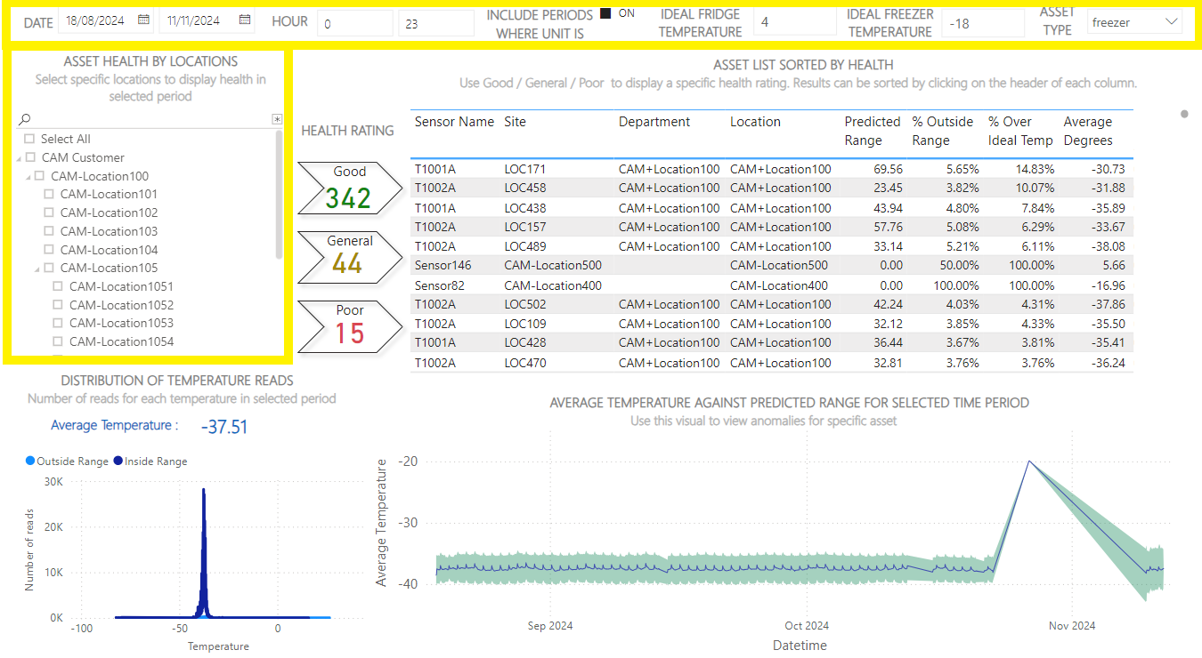
Chart Descriptions
|
Chart |
Description |
|---|---|
|
Health Rating |
This chart displays the total number of fridges/freezers in good, general, and poor health. To view information on the fridges/freezers in this total, click on a flag and the assets will be listed in the chart to the right (see image 4). To return to the previous view, deselect the flag. 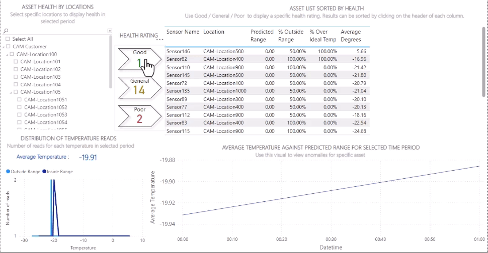
|
|
Asset List Sorted by Health |
This chart displays data on all fridges or freezers including:
To view data on individual fridges/freezers, click on a sensor in the table and the other charts will update. To return to the previous view, deselect the sensor. To sort data in ascending/descending order, click the arrow in a column header. |
|
Distribution of Temperature Reads |
This chart displays:
|
|
Average Temperature Against Range for Selected Time Period |
This chart displays:
|
Availability Tab
The Availability tab highlights fridges and freezers that were frequently unavailable (out of service) and the estimated sales opportunity lost as a result (see image 5).
To analyse your data:
-
Select the date range you want to view.
You can show data from up to 3 months ago.
-
Enter the average value of content (per unit).
-
Enter the inventory turnover per month (the number of times fridges & freezers are replenished per month).
-
Enter the cost of sales in % (per unit).
See image 6.
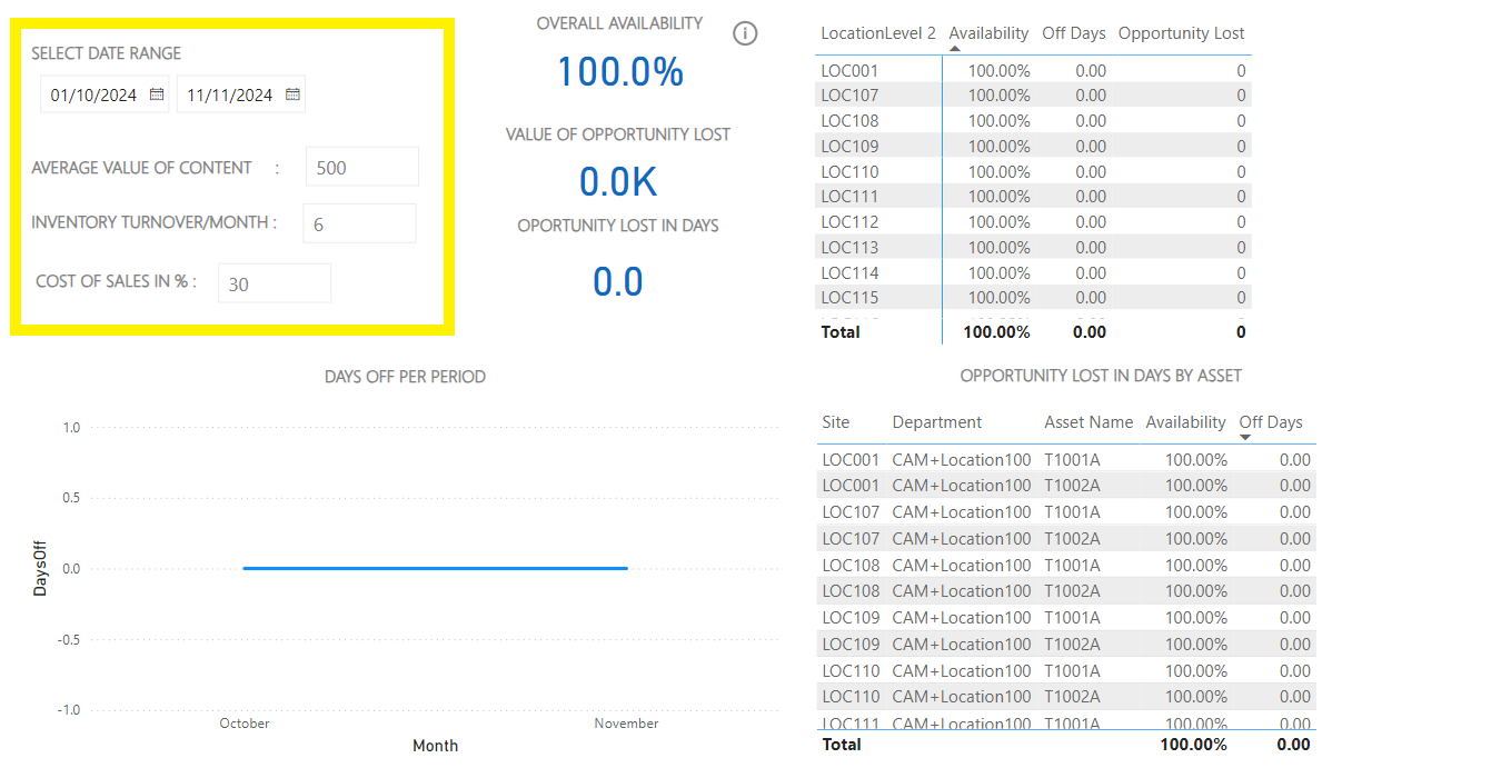
Chart Descriptions
|
Chart |
Description |
|---|---|
|
KPIs for Selected Period |
This chart displays 3 key performance indicators that summarise availability across all selected locations:
|
|
Opportunity Lost by Location |
This chart displays the following information on each location:
To view data on individual locations, click on a location in the table and the other charts will update. To return to the previous view, click the up arrow. To sort data in ascending/descending order, click the arrow in a column header. |
|
Day Off Per Period |
This graph plots the number of units out of service on each day. |
|
Opportunity Lost in Days by Asset |
This chart displays the following information on each unit:
To view data on individual fridges/freezers, click on an asset in the table and the other charts will update. To return to the previous view, deselect the asset. To sort data in ascending/descending order, click the arrow in a column header. |