Operational Insight summarises the performance of your locations and teams within the last month. It highlights problems such as sensors triggering alerts and work not completed.
We update your data every thirty minutes, so you can spot any issues and resolve them swiftly.
Operational Insight is an optional feature. Please contact us to enable it.
You must be an Administrator or Safety Manager to view Operational Insight. See User Roles for more details.
How To Access Operational Insight
-
Go to the Control Centre.
-
Go to Reports> Operational Insight
-
Select the location you want to view from the options on the left.
How to Filter Your Data
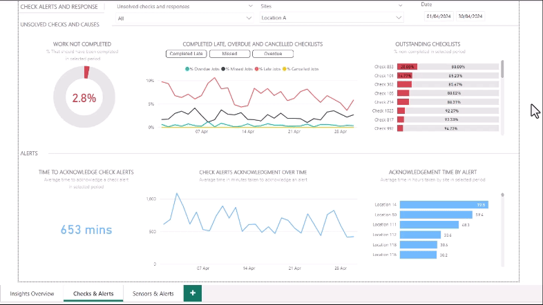
Filter by Location
To filter by location, click the ‘Sites’ dropdown menu at the top of the page. Hold down the Ctrl key on your keyboard to select multiple locations.
Filter by Date
You can filter by date within the last month using the calendar at the top right of the page.
This filter is only available on the Checks & Alerts and Sensors & Alerts tabs.
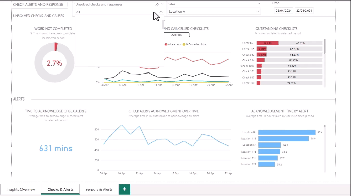
Filter by Checklist New feature
To filter by checklist, click the ‘Unsolved checks & responses’ dropdown menu at the top of the page. Hold down the Ctrl key on your keyboard to select multiple checklists.
This filter is only available on the Checks & Alerts tab.
Filter by Alert, Sensor, Team
Click on a bar within a table or point on a graph that shows data on an alert, sensor, or team. The other charts will refresh to show you data relating specifically to that element of the table or graph. To return to the previous view, click again.
Tabs Within the Page
The page consists of three tabs:
-
Insight Overview
-
Checks & Alerts
-
Sensors & Alerts
To navigate between them, select a tab at the bottom left of the page.
See below for full details
You may have less tabs depending on the number of products your company is subscribed to.
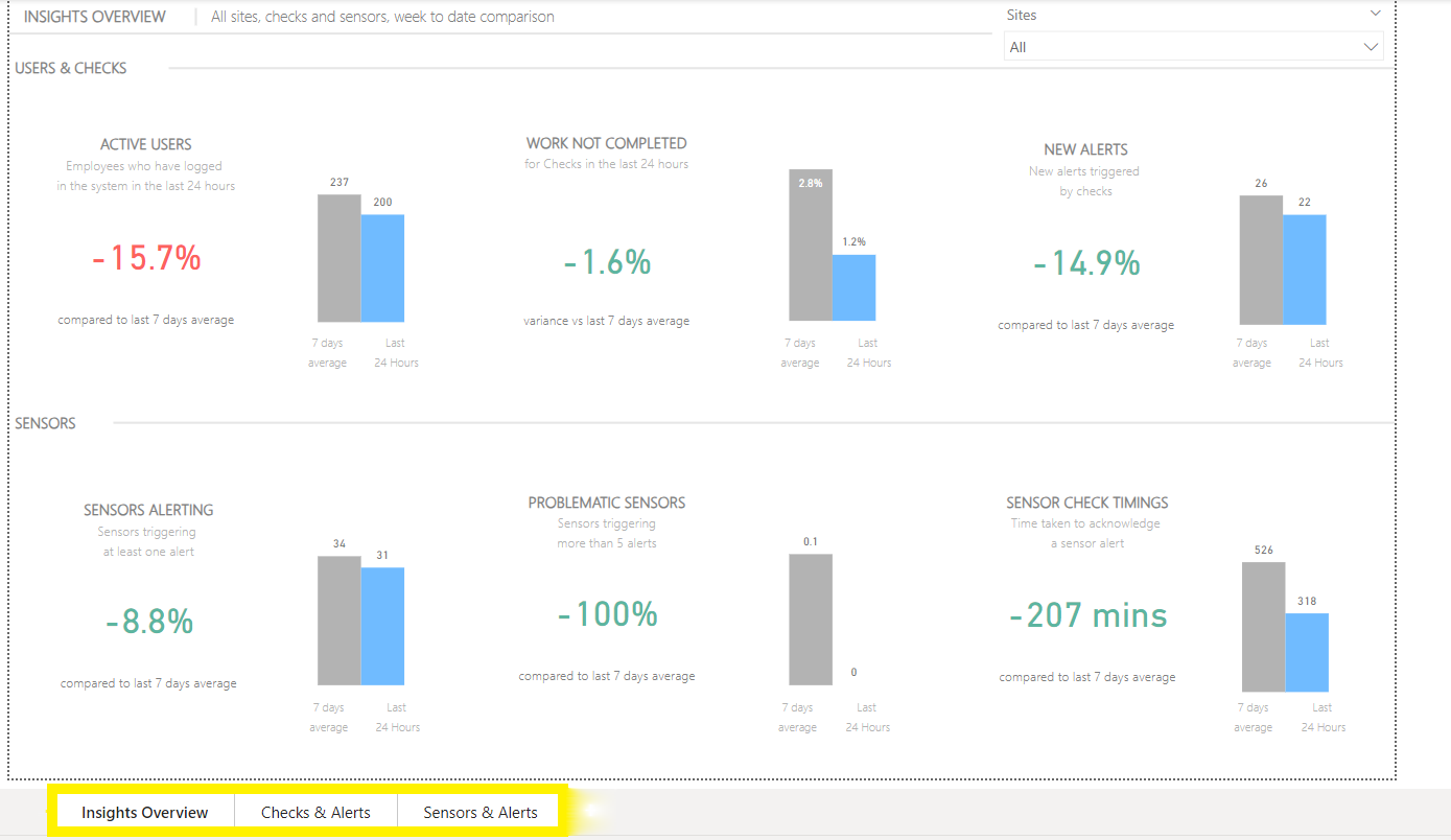
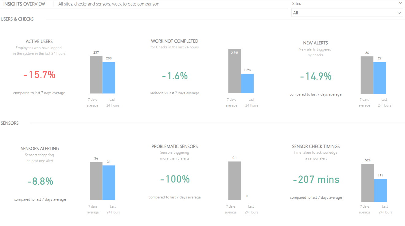
Insight Overview Tab
This tab shows you the number of people who logged into the app, checklists not completed, sensors triggering alerts, and average time taken to respond to check and service alerts over the last 24 hours, compared to the previous 7-day average.
|
Chart |
Description |
|---|---|
|
Active Users |
Number of users that have logged into the app |
|
Work Not Completed |
Percentage of checks that were not completed, including cancelled, missed (not started within the scheduled time) and overdue (started but not completed within the scheduled time) |
|
New Alerts |
Number of alerts triggered by checks |
|
Sensors Alerting |
Number of sensors that triggered an alert |
|
Problematic Sensors |
Number of sensors that triggered more than 5 alerts |
|
Sensor Check Timings |
Average number of minutes it took to acknowledge a sensor alert |
You may have less charts depending on the number of products your company is subscribed to.
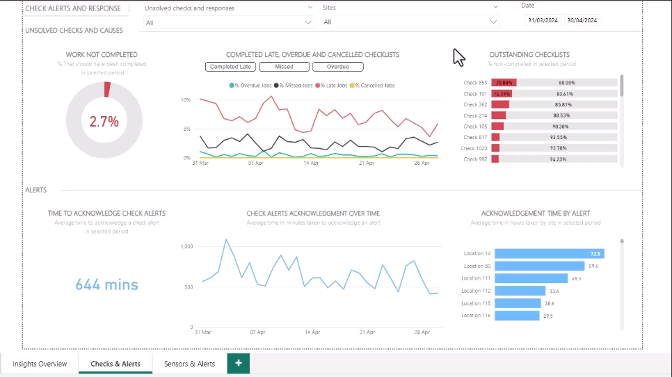
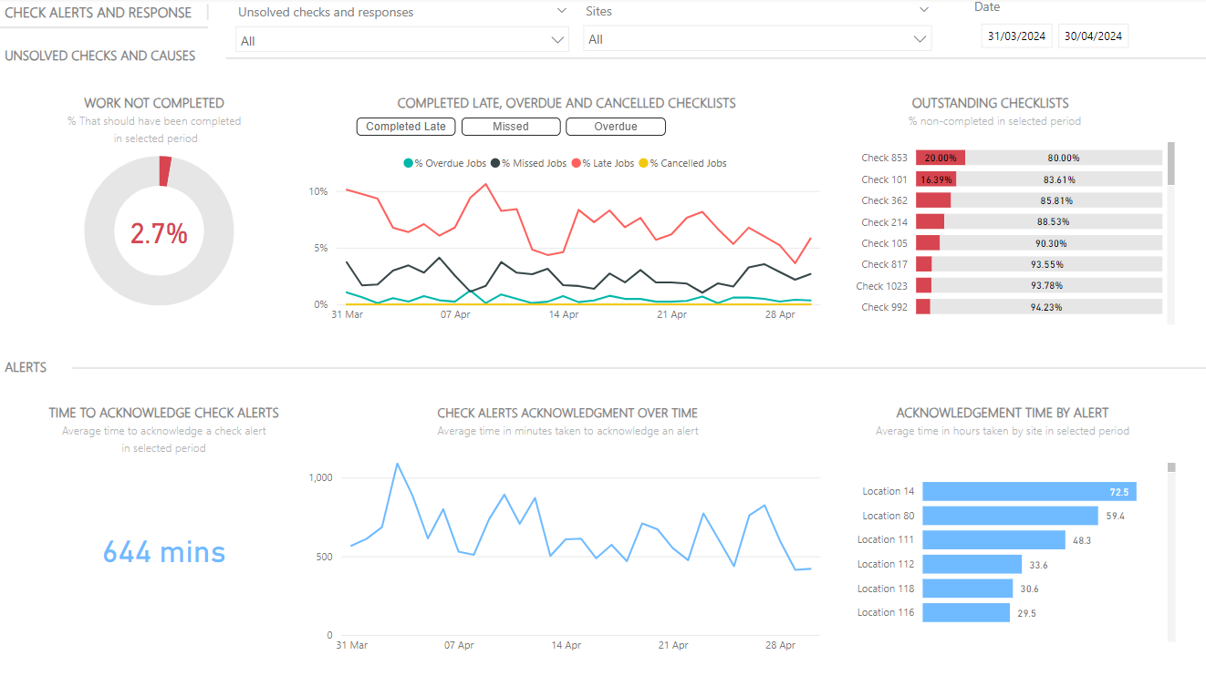
Checks & Alerts Tab
This tab shows you which checklists were not completed, when, and where. It also shows you how long it took on average to respond to check alerts.
This tab is only visible to customers who use the Checkit App.
|
Chart |
Description |
|---|---|
|
Work Not Completed |
This chart shows you the percentage of checklists not completed, including cancelled, missed, and overdue. |
|
Completed late, Overdue & Cancelled Checklists |
This graph gives you a day-by-day breakdown of the percentage of checklists that were completed late, cancelled, missed or overdue. Click the buttons above the graph to add or remove a category. |
|
Outstanding Checklists |
This table ranks all checklists that were not completed in descending order. To find out which sub-locations did not complete the checklists, click the double-down arrow above the table. This will show you a list of sub-locations ranked in descending order. Continue to click down to view further sub-locations. Click the up arrow to return to the previous locations. To find out which sub-locations did not complete a specific checklist, click the single-down arrow above the table, then click on a checklist in the chart, then click the double-down arrow to view sub-locations. |
|
Time to Acknowledge Check Alerts |
This chart shows you the average number of minutes it took to acknowledge a check alert. |
|
Check Alerts Acknowledgment Over Time |
This graph gives you a day-by-day breakdown of the average number of minutes it took to acknowledge a check alert. |
|
Acknowledgment Time by Alert |
This table ranks all your locations in descending order according to average time taken to acknowledge a check alert. |
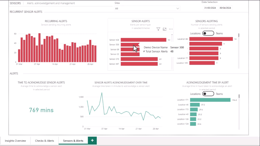
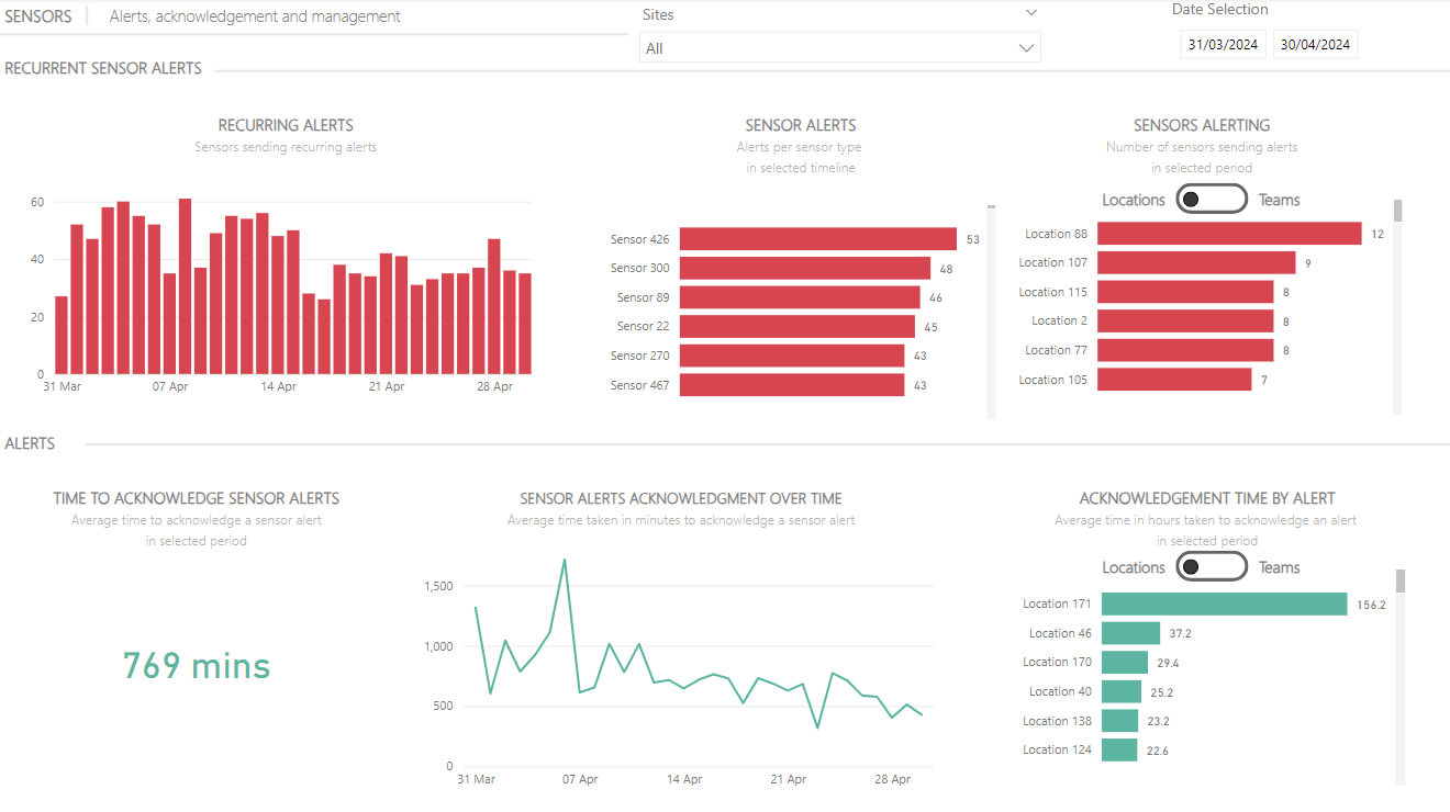
Sensors & Alerts Tab
This tab shows you which sensors triggered sensor alerts, when, and where. It also shows how long it took on average to acknowledge a sensor alert.
This tab is only visible to customers who use Checkit sensors.
|
Chart |
Description |
|---|---|
|
Recurring Alerts |
This table gives you a day-by-day breakdown of the number of sensors that triggered an alert. |
|
Sensor Alerts |
This table ranks all sensors that triggered an alert in descending order. |
|
Sensors Alerting |
This table ranks all locations / teams in descending order according to number of sensor alerts. |
|
Time to Acknowledge Sensor Alerts |
This shows you the average number of minutes taken to acknowledge a sensor alert. |
|
Sensor Alerts Acknowledgment Over Time |
This graph gives you a day-by-day breakdown of the average number of minutes taken to acknowledge a sensor alert. |
|
Acknowledgment Time by Alert |
This table ranks all locations / teams in descending order according to time taken to acknowledge a sensor alert. |