Energy Saving shows you how to save money and reduce carbon emissions by optimising the temperature of your fridges and freezers.
Asset Intelligence (including Energy Saving) is an optional feature. Please contact us to enable it.
How to Access Energy Saving
To access Asset Intelligence (including Energy Saving), you must be:
-
A Customer Administrator
-
Assigned the Asset Intelligence role (see Modify a User for instructions on how to assign this role)
-
Log in to the CAM+ Website.
-
Click Asset Intelligence at the bottom left of the page..
-
Select Energy Saving Feature from the Report dropdown menu.
-
Select the period you want to view.
-
Select the optimal fridge or freezer temperature. The charts will then update, comparing the optimal temperature with the actual temperature of your assets and displaying potential savings in costs and carbon emissions.
You can view up to 1 year of data.
We calculate cost and carbon emissions based on the UK or US average per kWh. We estimate that you could reduce energy costs and carbon emissions by 5% if you increase the temperature of your equipment by 1°C or 2°F.
To switch from freezer data to fridge data or vice-versa, deselect the optimal temperature of the equipment you are currently viewing, then select the optimal temperature of the other equipment.
Select a period of 1 month or more to analyse trends.
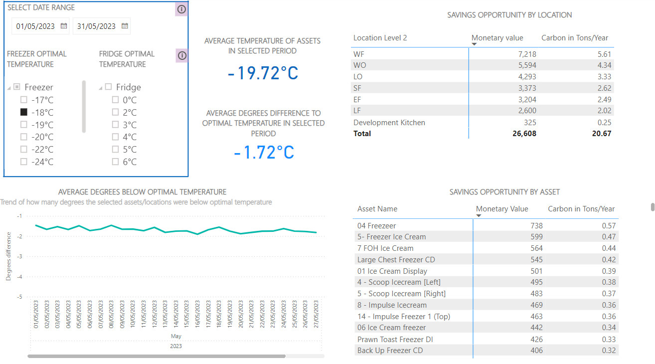
Chart Descriptions
|
Chart |
Description |
|---|---|
|
Average Temperature of Assets in the Selected Period |
This chart shows the average actual temperature of all fridges or freezers across all sites and departments within the specified period. |
|
Average Degrees Difference to Optimal Temperature in Selected Period |
This chart shows the average difference between the optimal and actual average temperature of all assets across all sites and departments within the specified period. |
|
Saving Opportunity by Location |
This chart shows how much money and carbon you could save per site/department over the specified period. To view data on a specific site/department, click on the site/department in the table and the other charts will update. To return to the previous view, click the up arrow. |
|
Average Degrees Below Optimal Temperature |
This graph plots the average difference between the optimal and actual temperatures at the specified site over the period. |
|
Saving Opportunity by Asset |
This chart shows how much you could save per fridge or freezer over the specified period. To view data on a specific fridge or freezer, click on an asset in the table. To return to the previous view, deselect the asset. |